
Tesseract Mixed Reality UI Toolkits
Toolkit v1 has been deprecated, please upgrade to Toolkit v2 or Toolkit v3 to enjoy the latest features and upgrades
JMRInputField needs to be updated with the new prefab JMRPrimaryInputField
Toolkits or JMRToolkits are intended to accelerate the development of Applications targeting JioGlass. In this section, we will learn how to use and customize the Toolkits.
It is recommended to use the JMRKeyboard in your applications that require a virtual keyboard. This helps to bring consistency for the end-user and reduces overall cognitive overload while using different applications with keyboards
UI Toolkits
To make the Jio Mixed Reality interface consistent and easy for developers to build upon, we have introduced drag-n-drop UI toolkits that can be easily configured to suit their needs while adhering to their brand guidelines.
Color System – Allowing developers to customize the colors of the toolkits from the menu bar.
Icon System – Allowing developers to change icons and text from inspector without disturbing alignment, font, and size on each toolkit
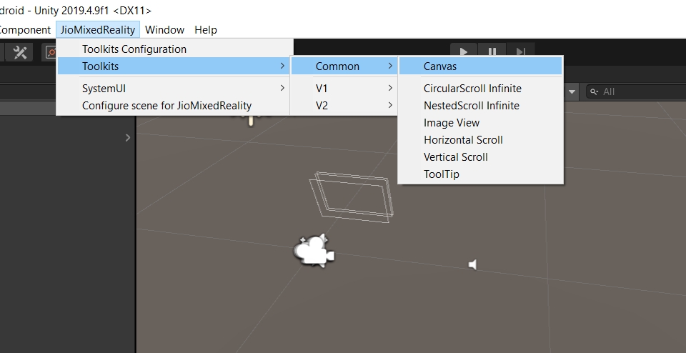
Toolkits -
Canvas
Button
Check Box
Check Box Group
DialogBox
Error DialogBox
Drop Down
Image View
Progress bar
Radio Button
Radio Button Group
Horizontal Scroll
Vertical Scroll
Search Field (With Keyboard integrated)
Slider
Toggle Button
Tooltip
Input Field (With Keyboard integrated)
VideoPlayer
Voice Toolkit
Using the Toolkits
To add any toolkit to the scene, go to JioMixedReality -> Toolkits -> then click on the Toolkit you want. Let’s see the usage of Toolkits with the help of an example.
To add any JMR UI Toolkit to the scene we first need to add the Canvas Toolkit. Go to JioMixedReality -> Toolkits -> Common -> Canvas to add it to the scene.
Alternatively, you can also create your Canvas using GameObjects -> UI -> Canvas. Click on Convert to JMRSDK Canvas. Change the position to (0, 0, 5). Change the X, Y and Z scale to 0.001. This scaling step is very important!
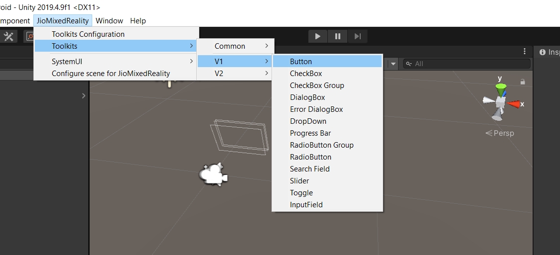
Let’s add the Button Toolkit to the scene. With Canvas selected go to JioMixedReality -> Toolkits -> V2 -> Button. JMRUIButton will be added as a child of the selected GameObject.
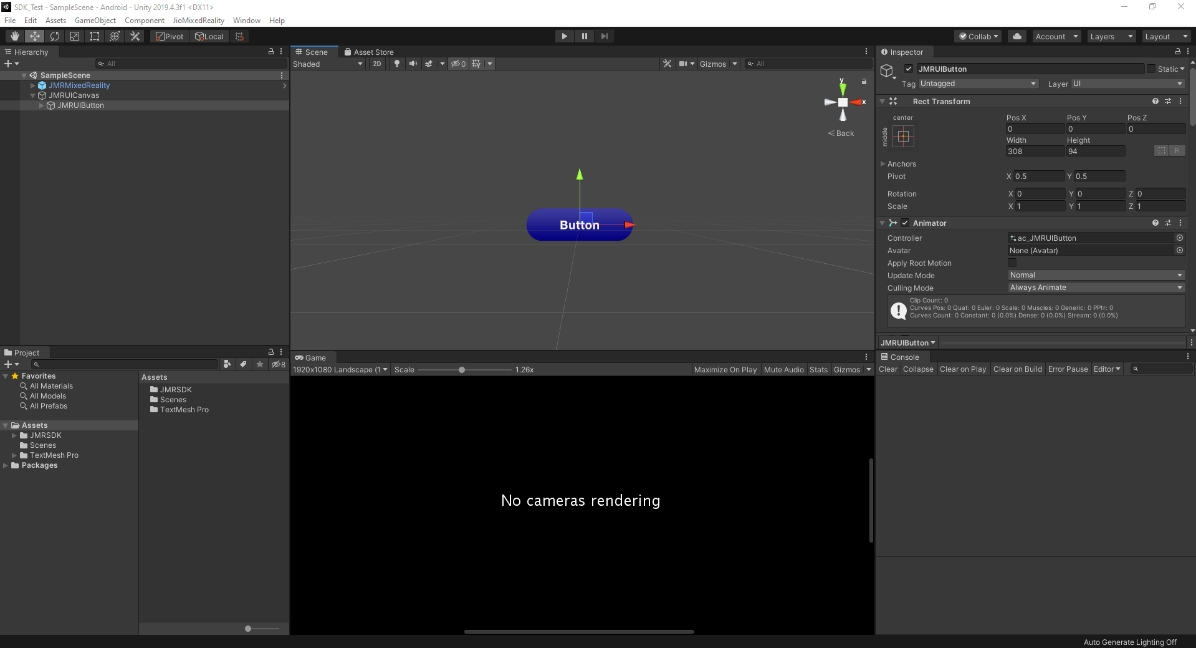
You can customize the Button to have Text or Image as its Icon Type
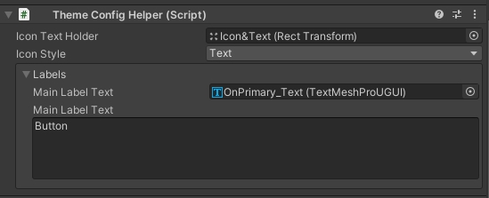
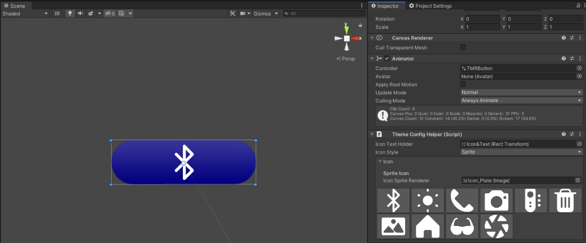
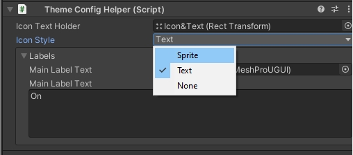
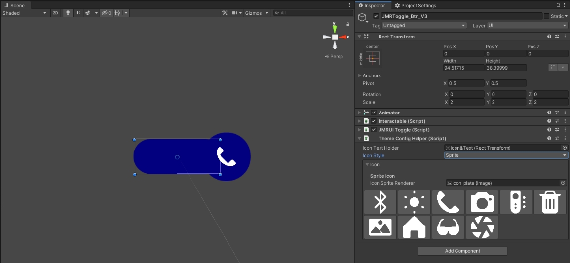
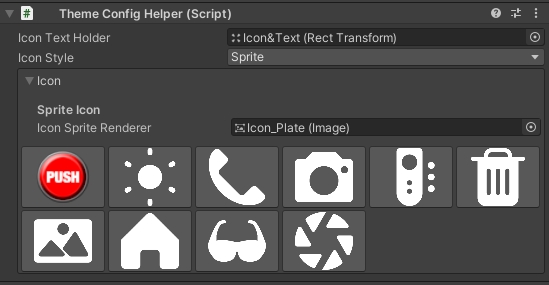
Go to the ThemeConfigHelper script attached to the Button. Open the Icon Style dropdown and select Sprite.
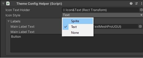
The section below the dropdown will now change and show you some images. Click on any one of the images and it will be displayed on the Button.
Open the Icon Style dropdown again and select Text. In the Main Label Text below the dropdown, change the text to “Click Me” and the same will be displayed on the Button in the scene.
To add an event on Button Click you can use the OnButtonClick event present on the JMRUIButton script on the Button.
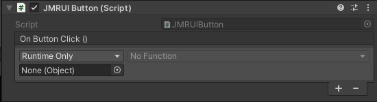
You can also add listeners to this event from other scripts.
public JMRUIButton button;
myButton.onButtonClick.AddListener(MyMethod);
Let’s take a look at another example.
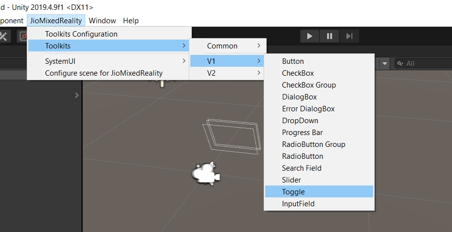
Again, with the Canvas selected, go to JioMixedReality -> Toolkits -> V1 -> Toggle and click on it. JMRToggle will be added as a child of the Canvas.
Just like we changed the Icon Type of the Button above, we can change the Icon Type of Toggle using the JMRThemeConfigHelper script on it.
To add an action when the value of the Toggle changes, you can use the OnValueChanged event present on the JMRUIToggle script on the Toggle.
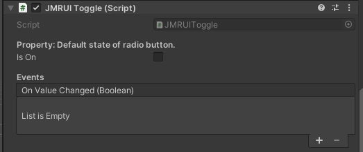
You can also add listeners to this event from other scripts.
public JMRUIToggle myToggle;
myToggle.OnValueChanged.AddListener(MyMethod);
Customizing the Toolkits
The colours and icons of all the toolkits can be changed at once using the Theme Configurator (TC). To open the TC, go to JioMixedReality -> Toolkits Configuration and click on it. In the TC window which opens, you’ll see 2 sections viz. Colours and Icons. Both these sections have some default values. Let’s take a look at each of these sections.
Changing Colors of the UI from Toolkit Configuration
You can change the default colours for each layer by clicking on them, in the Toolkit configuration window.
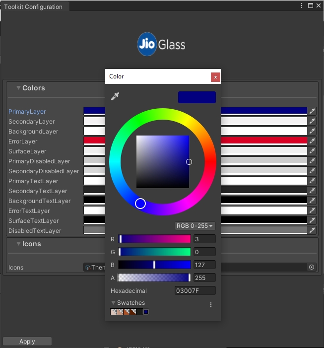
Let’s change the Primary Layer colour to some shade of green.
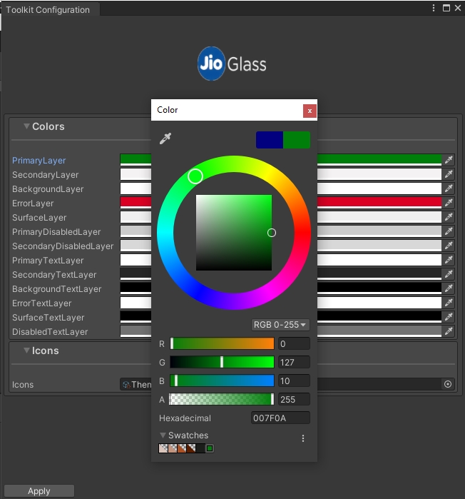
Click on Apply button at the bottom of the window to apply this change to all the Toolkits present in the scene as well as in the entire project.
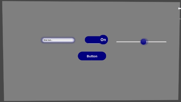
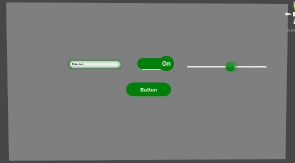
Before and After changing Color
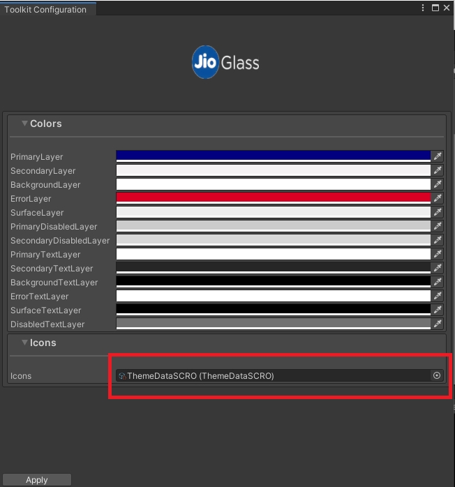
Changing Icons of the UI from Toolkit Configuration
Icons provide visual feedback to the user.
In the Icon section on the Toolkit Configuration window, you will see there’s a reference of a Scriptable Object named SO_ThemeData. (Assets\JMRSDK\JMRToolkits\ThemeSystem\ThemeConfiguration\ScriptableObjects\SO_ThemeData.asset)
Open the Icon Pool list on SO_ThemeData. These are the Icons which will be shown when you change the Icon type of any toolkit from Text to Sprite.
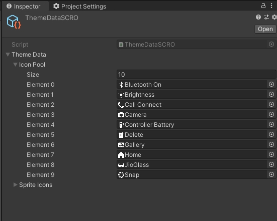
Let’s change the first sprite with any temporary sprite for testing.
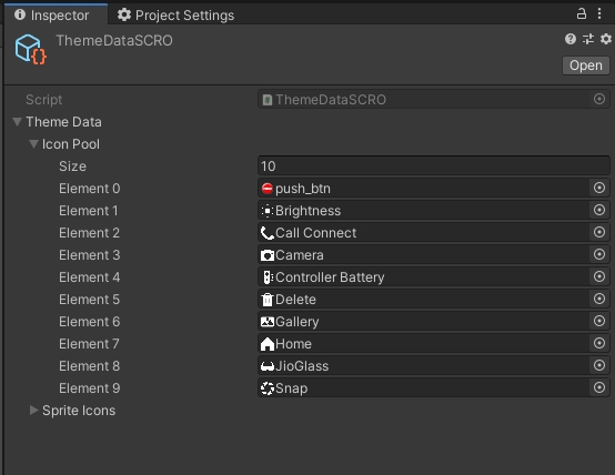
Now open the Theme Configurator window and press Apply.
Now add a Button toolkit to the scene and select Sprite in the Icon Type dropdown on the JMRThemeConfigHelper script on it.
You should see the newly added Icon in the list below.
JMRDragable Component
All existing custom-scrolls, sliders and all other draggable objects should have a JMRDraggable.cs script component on them.
1. Select ViewPort of existing CustomScrolls or Sliders.
2. Add component “JMRDraggable.cs” on it.
Last updated