Progress Indicator
Progress Indicators are used to show the completion status of an operation lasting for more than 2 seconds.
Progress Indicators can appear in a new panel, a flyout, under the UI initiating the operation, or even replacing the initial UI, as long as the UI can return if the operation is canceled or stopped.
Types
- Progress Indicator without known state - For indicating progress of a continuous event, such as loading a scene where the current state of the process isn't known.
- Progress Indicator with known state - For indicating progress of a continuous event, such as downloading a file where the current state of the process is known.
Best practices
Do
- Display operation description
- Show text above and/or below the bar
- Combine steps of a single operation into one bar
Don't
- Use only a single word description
- Show text to the right or left of the bar
- Cause progress to "rewind" to show new steps
Layout
Progress Indicator feature a bar showing total units to completion, and total units finished. The description of the operation appears above the bar, and the status in text appears Centre/below. The description should tell someone exactly what the operation is doing.
Progress Indicator without Known State
States
-50465-9cf86ba17f7016b63661a3f088f5986a.png)
Transitions
| Transitions | Front View | Isometric View |
|---|---|---|
| Appear |  |  |
| Active | 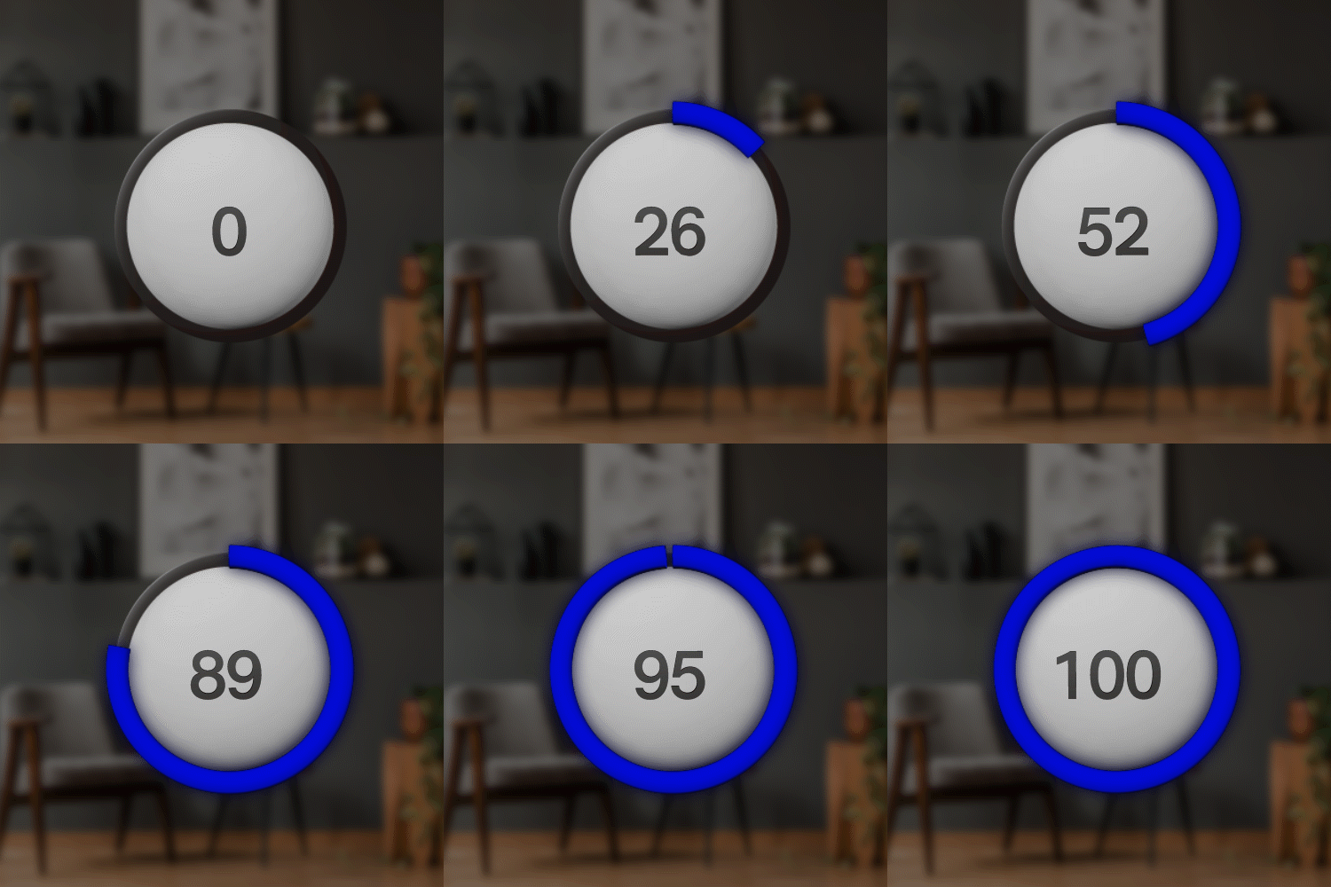 |  |
| Disappear |  |  |
Progress Indicator with Known State
States
-66660-455d4e066d9145b44dc404dcaa14e9e2.png)
Transitions
| Transitions | Front View | Isometric View |
|---|---|---|
| Appear |  |  |
| Active |  |  |
| Disappear | 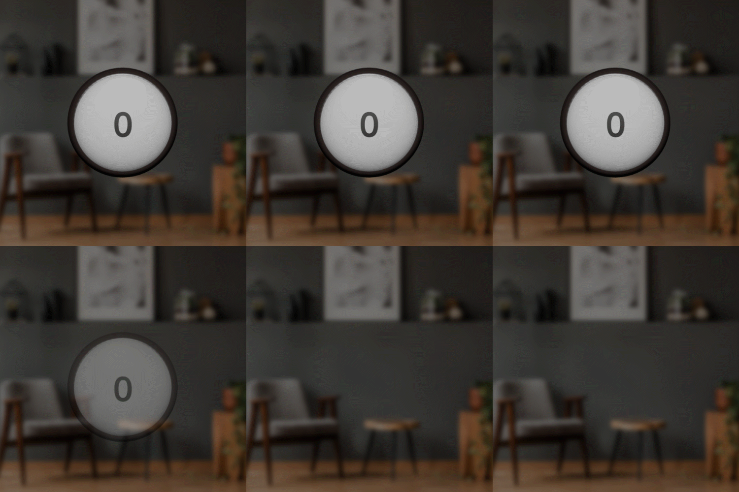 |  |