Check boxes give people a way to select one or more items from a group, or switch between two mutually exclusive options (checked or unchecked, on or off).
Types of Checkbox
- Single check box
- Multiple check boxes
Best practices
Layout
- Use a single check box when there's only one selection to make or choice to confirm. Selecting a blank check box selects it. Selecting it again clears the check box.
- Use multiple check boxes when one or more options can be selected from a group. Unlike radio buttons, selecting one check box will not clear another check box.
Content
- Separate two groups of check boxes with headings rather than positioning them one after the other.
- Use sentence-style capitalization (only capitalize the first word).
- Make it easy for people to understand what will happen if they select or clear a check box.
CheckBox
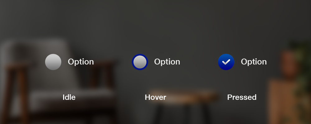
States
Transitions
| Transitions | Front View | Isometric View |
|---|
| Appear | - | - |
| Enter | - | - |
| Exit | - | - |
| Interact | - | - |
| Disappear | - | - |
Vertical Group Layout
States
Transitions
| Transitions | Front View | Isometric View |
|---|
| Appear | - | - |
| Enter | - | - |
| Exit | - | - |
| Interact | - | - |
| Disappear | - | - |
Horizontal Group Layout
States
Transitions
| Transitions | Front View | Isometric View |
|---|
| Appear | - | - |
| Enter | - | - |
| Exit | - | - |
| Interact | - | - |
| Disappear | - | - |