Color System
Color provides an intuitive way of communicating information to users in your app, it can be used to indicate interactivity, give feedback to user actions, and give your interface a sense of visual continuity.
Colors are primarily determined by accent color and theme. Here we'll discuss how you can use color in your app, how to use accent color(Primary & Secondary color) and theme resources to make your app usable in any theme context.
Best practices
|
|---|
|
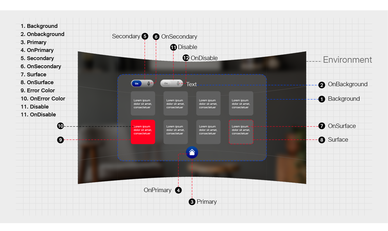
Defining the Color System in Tesseract Mixed Reality Design
Color Usage and Palette
- Primary color
- Secondary color

Primary and Secondary color mainly represent your brand to enhance your Interface in a consistent way.
Color Theme
- Primary color
- Secondary color
- Background Color
- Surface Color
- Error Color
All of these colors can be customized for your app.
"on" Color"
When a color appears "on" top of a primary color, it's called "on primary color." They are labelled using the original color category (such as primary color) with the prefix "on."
This category of colors is called "on" colors.
- "On" Primary Color
- "On" Secondary Color
- "On" Background Color
- "On" Error Color
"On" colors are specifically applied to text, iconography, and strokes.
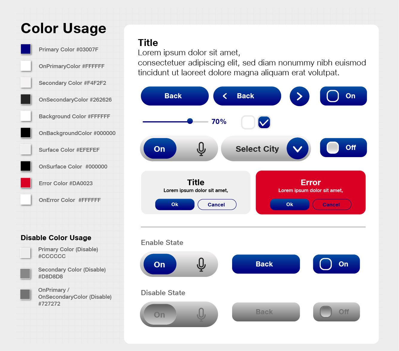
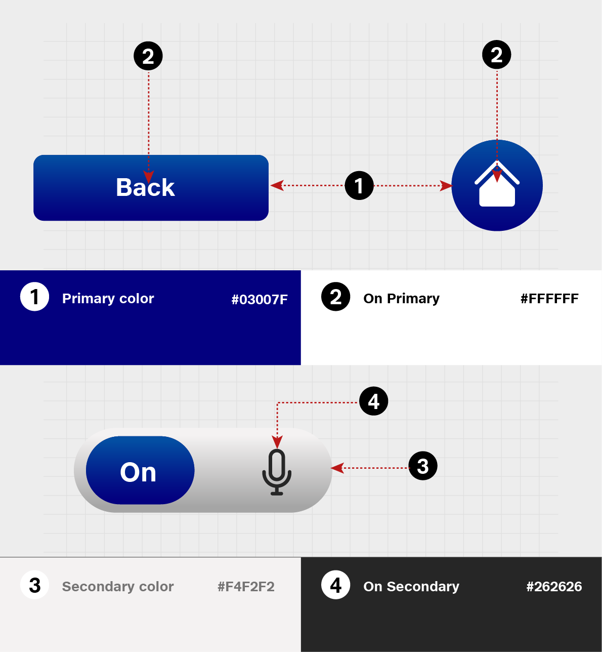
Color Codes for Tesseract Mixed Reality Design
Primary Color #03007F
OnPrimaryColor #FFFFFF
Secondary Color #f4f2f2
OnSecondaryColor #262626
Background Color #FFFFFF
OnBackgroundColor #000000
Surface Color #EFEFEF
OnSurface Color #000000
Error Color #DA0023
OnError Color #FFFFFF
Disabled Color
A disabled state communicates a non-interactive component or element.
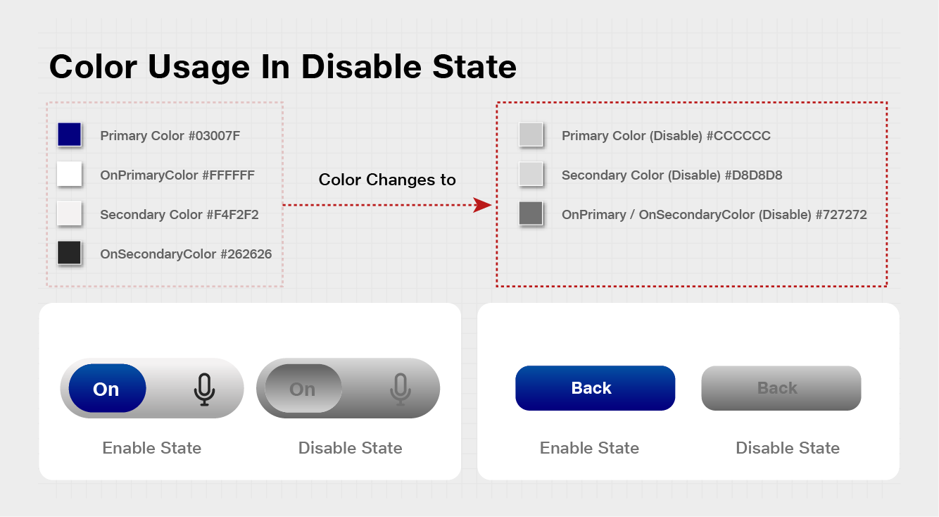
Color Codes
Primary Color (Disable)#cccccc
Secondary Color (Disable)#d8d8d8
OnPrimary/OnSecondaryColor (Disable) #727272