States
States are visual representations used to communicate the status of a component or interactive element.
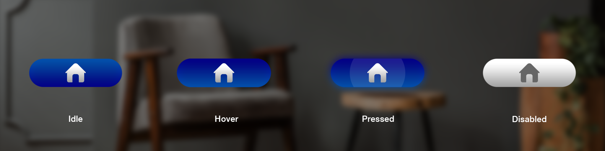
Button States
A button is completely defined by 4 states as described below -
| State | Description |
|---|---|
| Default/Idle | Default state of the UI element. |
| Hover | State of the UI element when the button is in focus. A slight glow will appear on the UI element when the user gazes at the UI element to indicate user |
| Pressed | State of the UI element when it is being interacted with. A hard glow appear on the UI element when the user interacts with the button by pressing a button |
| Disabled | State of the UI element when that UI element is non-interactable. A faded UI will be shown indicating that the UI is currently disabled means not active for interaction. |
Layout